ReactJS - Components
A React component is a fundamental building block of a React application. It is a self-contained, reusable piece of code that defines how a part of the user interface should look and behave. Components make it easier to manage and organize code by breaking the UI into smaller, manageable sections.
Types of Components:
- Functional Components – Simple JavaScript functions that return JSX.
- Class Components – Older style using ES6 classes with a
render()method.
Functional Component
Functional components are a simpler and more modern way to create components in React. They are written as regular JavaScript functions that return JSX, which is a syntax that looks like HTML. Functional components can accept props, which are inputs passed from parent components, allowing them to display dynamic content. With the help of React Hooks like useState and useEffect , functional components can also manage state and perform side effects, making them just as powerful as class components. Because of their clean and concise structure, functional components are now the preferred choice in most React applications.
function FirstComponent() {
  return <h1>Hello, welcome to FirstComponent!</h1>;
}

export default FirstComponent;
OR using an arrow function:
const FirstComponent = () => {
  return (
    <h1>Hello, welcome to FirstComponent!</h1>
  )
}

export default FirstComponent
Class Component
Class components are one of the original ways to write components in React. They use ES6 classes and extend React.Component . While functional components are now the preferred standard, understanding class components is still useful—especially when maintaining older codebases.
class Componentname extends React.Component {
    render() {
      return <h1>Welcome Text!</h1>;
    }
}
Creating Components
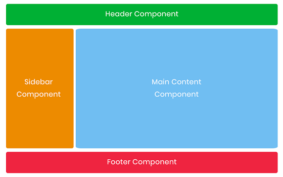
To build a structured layout in a React application, we create reusable components for each main section of the interface: Header, Sidebar, Content, and Footer. Each component is defined in its own file to keep the codebase modular and organized.
Create a components folder inside the src directory, and within it, create individual .jsx files for Header, Sidebar, Content, and Footer components.
src/
├── App.jsx
├── components/
    ├── Header.jsx
    ├── Sidebar.jsx
    ├── Content.jsx
    ├── Footer.jsx
import React from 'react'

const Header = () => {
  return (
    <div>This is Header Component</div>
  )
}

export default Header
import React from 'react'

const Sidebar = () => {
  return (
    <div>This is Sidebar Component</div>
  )
}

export default Sidebar
import React from 'react'

const Content = () => {
  return (
    <div>This is Content Component</div>
  )
}

export default Content
import React from 'react'

const Footer = () => {
  return (
    <div>This is Footer Component</div>
  )
}

export default Footer
Import Components Inside App.jsx
You can import the components into App.jsx using the import statement. Once imported, you can use the components just like custom HTML tags inside the App function. For example, placing <Header /> inside App.jsx .
import React from 'react';
import Header from './components/Header';
import Sidebar from './components/Sidebar';
import Content from './components/Content';
import Footer from './components/Footer';

function App() {

  return (
    <div>
      <Header />
      <Sidebar />
      <Content />
      <Footer />
    </div>
  );
}

export default App;
Output:
D:\React\cd my-app>npm run dev
Open http://localhost:5173/ in your browser to see your new React app running.
